As part of our decorating plans, John and I had decided to go a little dramatic in the dining room with the wall color. With the exception of my library and our butler’s pantry, the whole house was painted in Benjamin Moore’s Moonlight White which was the perfect background for art and looked lovely in just about any light. But early in 2023, I was starting to understand that I could make unilateral decisions and contemplating what color I would use to make the bold statement in the dining room that John and I discussed, I realized I didn’t need to stop with just that one room, so I really leaned into my Farrow and Ball obsession.

I kept the Benjamin Moore Moonlight White in most of the house, but I did decide to punch up two bedrooms, three bathrooms, and the dining room. It was not all smooth sailing. Despite much sampling, mistakes were made. Expensive mistakes.

Like a kid in a candy store, I had trouble limiting my sample pot purchases. They had a three-for-two sale which made that part less expensive, but it is hard to be decisive when all the colors are interesting and you don’t have the knowledge to understand how they are going to work when they coat an entire room.

At the point I was choosing paint, the only object I knew was going to be in dining room was this burl wood sideboard I found on Chairish.

The winner was Cola from Farrow and Ball’s Archive Collection. It is definitely dramatic and turns the dining room into a bit of jewel box with all the surrounding rooms remaining in the Benjamin Moore Moonlight White.

The print above the sideboard is one that John had in his office at work when he died. I totally forgotten about it until after the room was painted. When I went up to the attic bedroom one day it was leaning against the wall and struck me as being absolutely perfect for this spot. The size, the contrast of the white background, and the similarity between the color of the wood of the frame with that of the sideboard really works.

Next up was a guest room on the second floor that is used a lot by a good friend who stays over frequently. She loves pink and Farrow and Ball have a lot to choose from on that front.
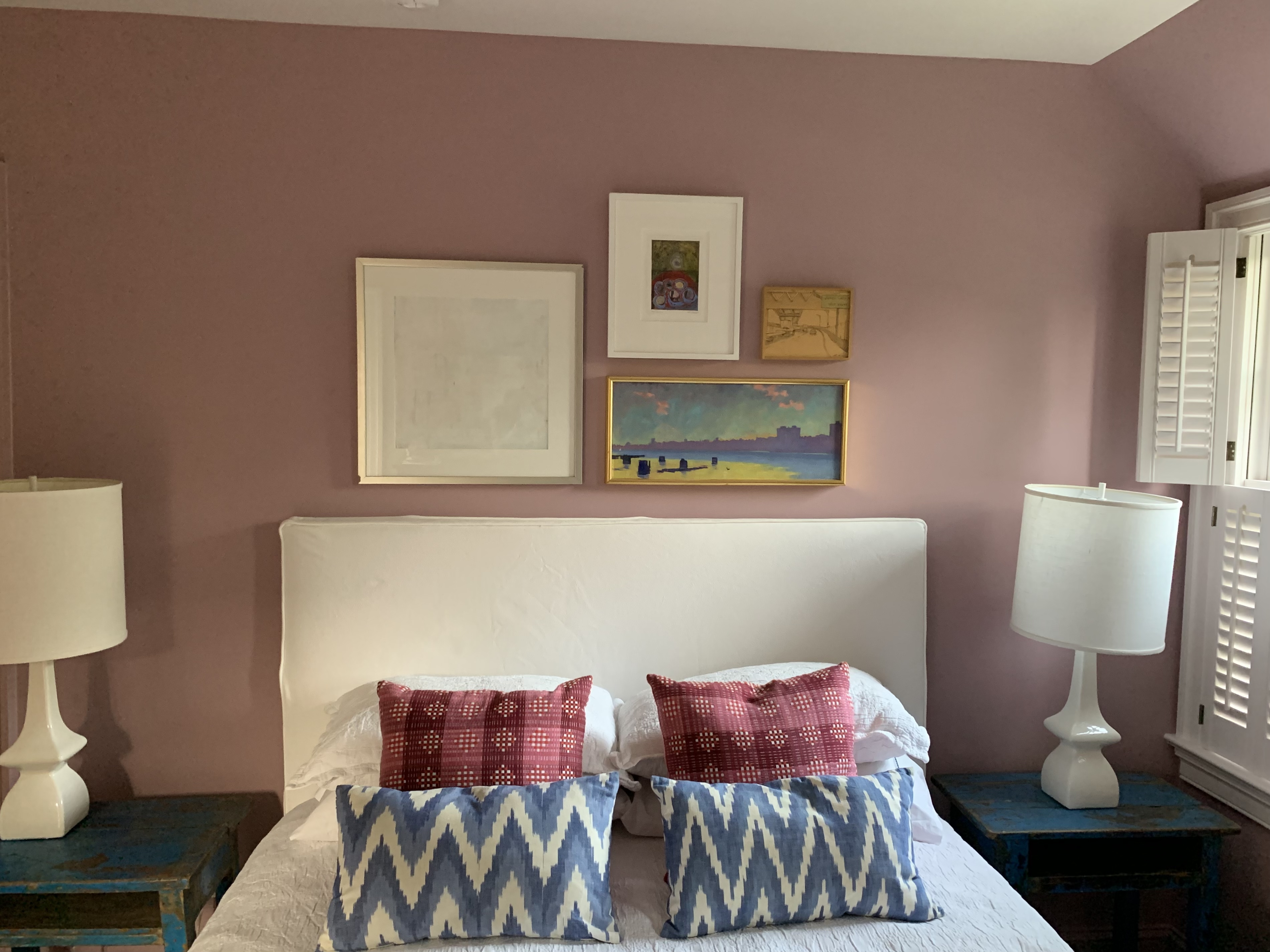
I ended up choosing Cinder Rose. The windows, French door, and ceiling are in Great White.

Unlike the windows and French Door, the interior doors and the baseboards were done in the Cinder Rose as well as the walls.

This is where the big expensive mistake happened. The person we hired to help us decorate had recommended something in the green family and chose this range of green. He said he wanted something “happy” in my room. I like all of these in concept and chose Green Ground, the one on the far right. When I first saw the room painted in the color, the contrasting white shutters, windows, doors, etc. made it look a bit too much like the 1990s. So, instead of questioning the choice of the green in the first place, I leaned into it and made a very expensive mistake, I had the painters do all of the woodwork including all of the shutters in the same green. The result was a green room that absolutely strobed. I tried to live with it for a few days and contemplated how I could decorate the room to tone down the effect.
Then Lucy walked into the room and her white fur was reflecting green. I had a green dog. So I bit the bullet and had the painters repaint everything, including all the shutters and woodwork. A very expensive mistake.

Unfortunately, I don’t have a picture of the few days that the room was green, but you can see here what I pivoted to. Farrow and Ball has so many sophisticated complex neutrals, I decided to go with Old White on the walls and Slipper Satin on the woodwork. It’s subtle and changes shade a lot during the day. I love it. I just wish I hadn’t had everything painted green first.

One paint idea the decorator had that was successful, was to paint the interior of my front door in Stiff Key blue. (He wanted it in high gloss, but I went with a satin finish instead.) I love it every time I walk by.

Thomas! So good to see your postings n hear how u doing. I’m just a fan in Phoenix. U r responsible for me switching doz yrs ago from NF to fiction..starting w Barbara pym…
And I can never thank you enough.
Think of you often.
Of course u can’t b blogging! Not with picking paint colors! Is there a more anxiety producing chore….
Luv your choses..esp the dining room…luv dark wall colors.
Makes room cozy n private….
Off to read your other postings.
Just had to say..luv u amigo.
U were my 1st book blogger mentor..and the best.
(Somehow pages won’t let me comment in comment section)
Take care,
Quinn
Sent from my Verizon, Samsung Galaxy smartphone
Get Outlook for Androidhttps://aka.ms/AAb9ysg
LikeLike
I think I’ve seen most of these evolutions on instagram or elsewhere, but I love seeing it – I’m all for bold decisions, and the results are marvellous.
LikeLike
These are gorgeous colors. You’ve *almost* inspired me to do some painting in my place!
LikeLike
I am a huge fan of color on walls – we recently did our bedroom in Sherwin Williams “contented green” and it is the most relaxing color. Selected to work with my warmer colored winter linens as well as my cool colored summer linens. Love the back of your front door!
LikeLike
I love that Cola colour. We recently changed our bathroom from lemon and egg yolk yellow to a very dark blue, and the top front room which is now my husband’s study from mucky cream to bright yellow, and both are thankfully very pleasing.
LikeLike
Wow! Those rooms turned out great – I love the dining room! And, I love the idea of painting the interior side of the front door.
LikeLike
My dining room is Green Ground! However with pale-ish wood furniture and floor and white ceiling/skirting/frames/radiator, it works very well. I read somewhere (wish I could remember where) that green is not a good wall colour for bedrooms – apparently it can be depressing, so I’m glad you changed your mind.
LikeLike