My Sunday Painting feature is the perfect way to kick off my first contribution to NYRB Classics Reading Week hosted by Mrs. B and Coffeespoons.
One thing that is so brilliant about NYRB Classics is the wonderful cover images that make one stop and take second notice.When I first noticed NYRB Classics a year or two ago it was the cover art that caught my eye. I had never seen this imprint before and I might not have if not for the distinctive cover design. Something so wonderful, and comforting to the OCD in me, about the standard design template for these covers. (My plea now to NYRB is that they not alter their template…)
And lest some of you berate me for judging books by their covers, if it weren’t for those arresting covers I would never have picked up some really amazing books, some of which I will talk about later this week.
So, here are four great NYRB covers and the paintings from whence they came. NYRB also does some great photo images, but since this is Sunday Painting, I am limiting myself to that medium.
 |
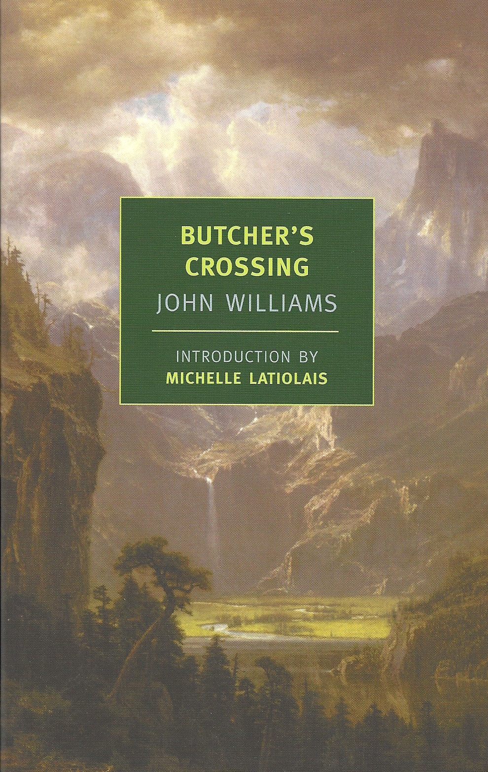
| Lander’s Peak, Rocky Mountains, 1863 Albert Bierstadt (1830-1902) Fogg Museum, Harvard University |

 |
| Hands (Man in the World), 1925-26 Pavel Filonov (1883-1941) The Russian Museum, St Petersburg |

 |
| High Steppers, 1938-9 Walter Richard Sickert (1860-1942) National Galleries of Scotland |

 |
| The Bend in the Road, 1902-1906 Paul Cezanne (1839-1906) National Gallery of Art, Washington |


Unfortunately, I must admit that I have yet to read a NYRB classic. I am, however, a big, shallow “judge books by their covers” sort of reader. NYRB's covers are definitely the sort that make me stand up and take notice and desperately *want* to sample a few of their classics. And hey, if a great cover can get me to read a great book that I might not have considered otherwise, the more power to it, right? =)
LikeLike
I would never judge you for judging a book by its cover – I do it all the time! :) Beautiful post and perfectly in sync with your usual Sunday Painting feature. And I also hope that they do not change the template. Appreciate all the small details right down to the NYRB colophon. Lovely.
LikeLike
What a lovely post Thomas and a great way to kick-start the week. I do love their covers, their binding and even their paper. There's just something different about them. The quality of the books are top notch. It's obvious a lot of thought and care goes into the choice and production of each one.
LikeLike
I judge books by their covers all the time. Sometimes by their back cover and spine, too.:)
I wish there were somewhere we could read the process that goes into the selection of the cover art of NYRBs. They really are fantastic. By the way, thank you for your first contribution to the reading week!
LikeLike