Wasn’t sure what to post today for Muriel Spark reading week until I saw Simon’s post about Spark book covers. It made me go to my shelves and pull down all the Sparks I own to take a look at their covers. Out of the thirteen I own (which aren’t actually the same as the thirteen that I have read) most of them have really bad covers. In some instances there are covers that I don’t particularly like, but they at least capture something about the book or author that makes them seem just right.
I decided to do a side-by-side comparison. (After you are done looking at these, you really should go over to Simon’s blog where he has some much more interesting ones. I particularly like the old Penguin covers from the 1960s.)
 |
| I think both are bad design. I like the image better in mine on the right, but the photo is a bit misleading. |
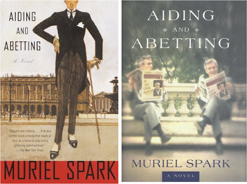 |
| I really like Simon’s cover on the left, but I think it is more appropriate for something by PG Wodehouse. |
 |
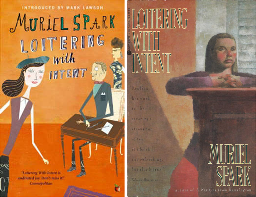
| I think the one on the left from Simon’s blog wins hands down. Not only is it a million times better than my lame cop, but it is interesting and evocative in its own right. |
 |
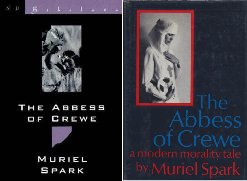
| I don’t like the one on the left in general because I tend not to like this kind of photo illustration. Plus this one makes the book look like chick-lit. The one on the right captures the subversive quality of Spark like a Blathus painting. |
 |
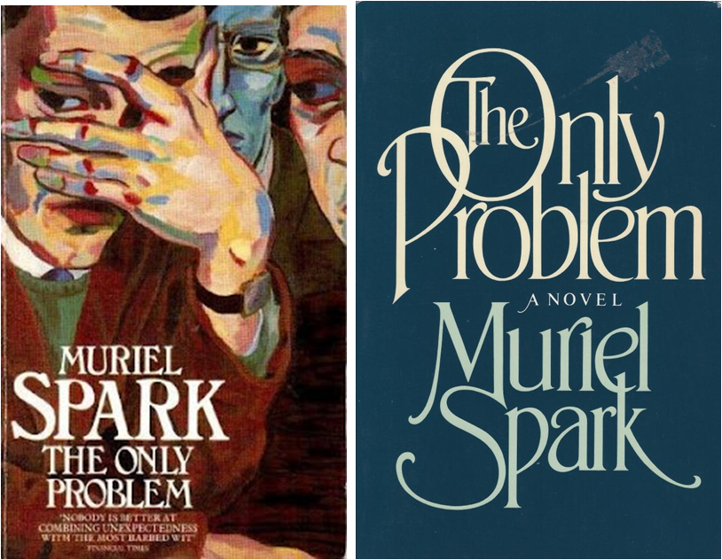
| While this book is pretty amusing, I think it has bite as the cover on the right says. The one on the left is just too frivolous. |
 |
| These are both boring as toast. (Although I love toast, and love books and movies that have English people buttering toast.) |
 |
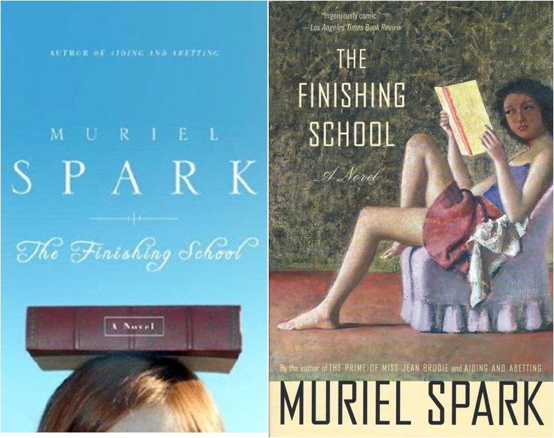
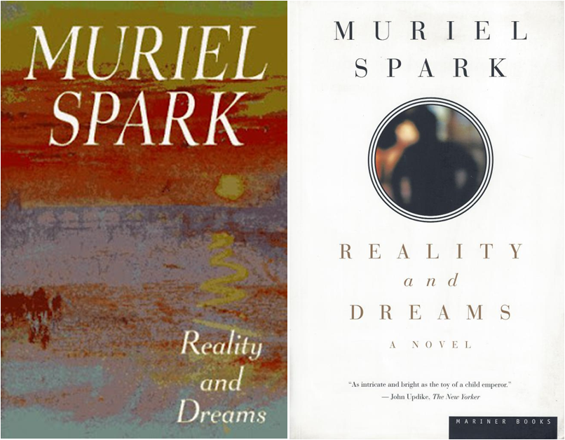
| I really don’t like my copy on the right in person, but I kind of like it better on the screen. But overall I would say that Simon’s version is more Sparkian. Although I haven’t read this particular title.  |

I don't mind boring so much, but some of those are just misleading!
LikeLike
It's really interesting to see how different covers could influence a shelf browser one way or the other. I really like the right-hand cover of The Finishing School and absolutely agree with you on the PG Wodehouse looking cover of Aiding and Abetting, pretty spiffy!
LikeLike
I saw the left Finishing School somewhere else and really liked it (something about the balancing book). I've never read it, but that cover would definitely influence my purchase. My copy of Loitering With Intent is different than your two. I'm about 60 pages in at the moment. Link here: http://www.amazon.com/Loitering-Intent-Muriel-Spark/dp/0811214745/ref=sr_1_1?s=books&ie=UTF8&qid=1335317529&sr=1-1
LikeLike
Fascinating — thanks Thomas
LikeLike
I've never read any Muriel Spark but I liked looking at these covers regardless- the range of styles is so different, it's intriguing.
LikeLike
I posted up three old Penguin covers for Muriel Spark week. They are pretty good ones. Two of them are not on Simon's blog though he has some great ones. Enjoy the week of Muriel. Pam
travellinpenguin.blogspot.com.au
LikeLike
Great post! I wish I had all the interesting covers I posted – mine are mostly Penguins from the 1970s (blurry, affected photos of people) or 1990s, which are ok – like the one I chose on my post for Territorial Rights.
LikeLike
Art: I agree misleading is the greater sin.
Darlene: I agree. If I didn't know Spark, I would pass many of these up just basedon their covers.
Susan: Your LWI is better than the cartoony one, but it is also one of those Spark editions that are fine but a little non-descript and generic for what is contained inside.
Harriet: Glad you liked it.
Jeane: You really should give Spark a try.
Pam: I love your covers.
Simon: Thos blurry 1970s photos on the Penguins are pretty humorous.
LikeLike
I've been collecting books with cool covers lately. I think we're in a very good period for cover art right now certainly if you look at the lines of books coming from smaller publishing houses.
These were fun to see, but I don't think any of them would win a design award.
LikeLike
CB: I couldn't agree more. None of these are very good.
LikeLike