Persuasion
Jane Austen
With so much written about her over the years, how does one “review” Jane Austen. One doesn’t. At least this one doesn’t. Although I find reading Jane Austen enjoyable, and I completely understand the literary and sociological merit of her work, I tend to like the Jane Austen films better than the books. (Please, no hate mail.)
So you will get no substance out me on Persuasion. It is actually one of my favorite JA flicks. But the one from 1995. I am not so sure how I feel about the version from 2007, I seem to remember the plot of it was skewed differntly than the ’95 version. Now that I have read the text, I want to see both of them side by side and make my determination not only about which one I like, but which one is closer to the text. I have them queued up on Netflix, so I should be able to blog about that in the near future.
What I really want to talk about is the cover of the edition I read. I picked it up at that English bookstore I went to in Den Haag. As far as I know, we don’t have these Penguin Popular Classics editions in the US. I was totally drawn to their simple, GREEN covers. But when I tried to photograph it, it came out very bright greeny yellow. I thought it was something to do with my camera skills. So this morning I tried to scan the cover and the same thing happened to the color. So I headed off to the Interwebs to see if I could find a good representation of the color of the cover. And I did, BUT, I also came across many, many, many other pictures that suffer from the same yellowing problem that I had.
It is like vampires not showing up in mirrors. Have the scientists in the Penguin laboratory discovered a way to make their covers not appear correctly in photos? Also, I love the fact that they are using recycled pulp, but it doesn’t make the tactile experience very pleasant. UPDATE: I just noticed that even The Book Depository wasn’t able to get images with the proper color covers.
See if you can guess which of these images is mine.
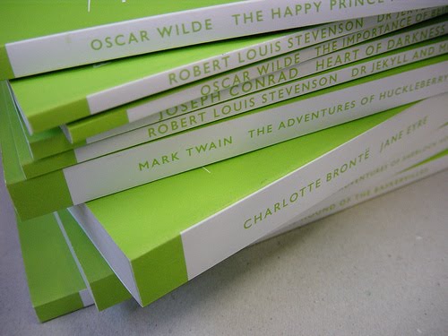


There are certain book covers/colors that I simply cannot capture. And (I whisper) I am not an Austen fan, not of the books or movies – though I like the latter better. I don't like the Brontë girls either.
LikeLike
I tend to like Austen more than the Brontes.
LikeLike
How strange!
I love Austen, but Persuasion is my least favourite. I was told to wait til I was 30 to reread…
LikeLike
I suppose the plain covers beat the usual approach of grabbing whatever piece of vaguely period art happens to be to hand.
LikeLike
How bizarre! That is the weirdest phenomenon.
I read Persuasion a few months ago; it was the last Austen novel I had left to read and I enjoyed it a lot.
LikeLike
I once did a paper in college on Pride and Prejudice and never read the book. There was so much written about it that it was like I had read it . . . I am ashamed now but at the time I was glad to get an A. But I love the movies and BBC versions of the books! That green phenomenon is strange.
LikeLike
Simon: 30 was 10 years ago for me, so I have probably achieved the necessary maturity. :)
Stu: I love the plain covers. But think it would also be fun to be the person who gets to find the vaguely period art for all the other covers. That's a job I would take.
Claire: The cover color thing is very weird. The number of others who have had the same problem is really quite amazing.
Denise: We all did stuff in College that we are ashamed of. At least you didn't end up in the hospital or jail.
LikeLike
I love these Penguin editions – they are so seductively matchy and cheap. I want to buy them all and writes notes in the margins, and not feel guilty because they're only two quid and they're on recycled paper!
LikeLike
Very very nice collection. It's nice to have a series of books all in the same edition huh? Makes it look a lot better for the shelf :)
LikeLike
Thomas – just nipping over after receiving your lovely compliment on Random. THANK YOU.
I adore Persuasion, it is my favourite Austen and here is a link to a post I wrote some time ago which you may like to read.
http://randomjottings.typepad.com/random_jottings_of_an_ope/2007/01/persasion.html
LikeLike
Not sure if the link has shown up completely – let us try again
http://randomjottings.typepad.com/
random_jottings_of_an_ope/
2007/01/persasion.html
LikeLike